It’s a situation that slowly creeps up on you, gradually leading to a harsh realization. A realization that calls for drastic measures. An information you’re missing and you seek it at its source. A question asked by a user, making you think “it would be nice to write it down somewhere.” An explanation you can’t find anywhere. Or maybe not where you’d like it. Or not quite in its entirety.
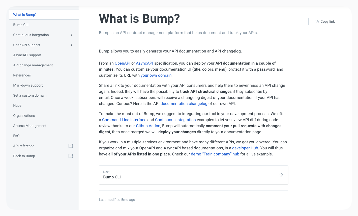
You have to face reality: this Help Center may no longer be up to date. For us at Bump.sh, this is especially important as we’re dealing with a technical, sometimes complex topic that requires precision, thoroughness, and the ability to simplify when necessary.
So here we are, in June 2023, deciding that it’s more than time to roll up our sleeves.
Preparation
However, before diving headfirst into the frantic writing of our future Help Center, and even though the itch to write is strong, we must prepare for the immense task ahead.
We wanted this Help Center to cover not only our entire product but also peripheral questions related to our topic: API documentation. Upon closer examination, it didn’t take long to realize that even internally, knowledge was scattered, sometimes held by just a few of us.
We started by taking a comprehensive tour of the product, creating an inventory of every feature, every element of Bump.sh. It took several meetings with the Product team to complete this detailed overview before delving into specific points with the Engineering team.
With the complete list in hand, we were ready to dive in. After a quick warm-up of our fingers, they started dancing on the keyboard, composing prose rivaling that of the greatest authors of this… no, sorry, that’s not true.
Thoroughly inventorying each feature of Bump.sh was the very first step of a long journey, and diving into writing so soon was a mistake that cost us a lot of time. Without having prepared a Help Center structure in advance, we couldn’t achieve a result we would be proud of. After a few weeks of writing scattered pieces of documentation, it quickly became evident that we needed to be better prepared.
Preparation. Take Two.
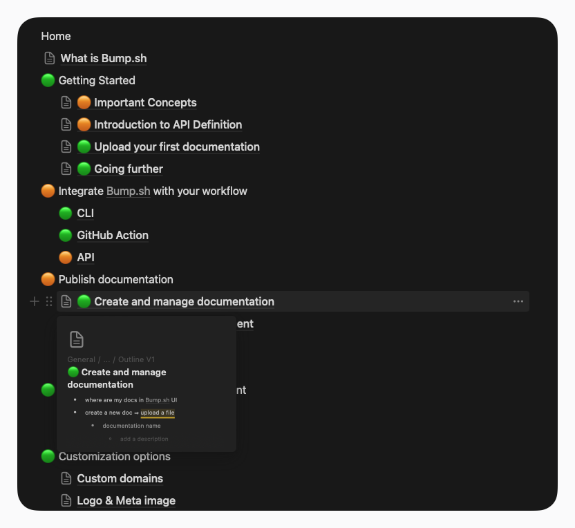
An outline. That’s what our ambitious endeavor was missing: a structured and exhaustive plan for our future Help Center. What each page, each category would contain. The substance, without the form. Once again, we thought we had completed the exercise in a matter of days. Once again, we were wrong.
First, defining a first level to the help structure. It’s not just about taking the plan of our app and listing it as is. Structuring a Help Center also requires putting ourselves in the users’ shoes, regardless of their expertise on the matter.
The outline preparation was done daily. To avoid getting stuck unnecessarily on a section or slowing down the progress of others, each section of the outline was reviewed as soon as it was completed. Exceptionally, we opted for regular synchronous review calls to discuss the choices made and adjust the content of each page/section as effectively as possible.
In what order do we explore the product? Which features should be highlighted first in the flow of this discovery? How to make precise information accessible to advanced users who already know the product well? What will seem natural at that moment?
And a big question: how to avoid duplication? Some elements apply to different levels of the product, different features. But do we want to repeat the same sentences in three places in our documentation? Or should we choose a single page but linked from these three places?
At the same time, we weren’t looking to reinvent the wheel. We observed dozens and dozens of technical documentations, Help Centers, and other Product discoveries. We wanted to offer as complete and natural an experience as possible, wondering where our community looked for help with their other tools.
Originally, our Help Center used Gitbook which, despite its qualities, didn’t quite fit our use case and future needs. Our initial trials were with Docusaurus, a well-known tool. Despite its justified popularity, we chose to explore other options. Firstly, since our tech stack is in Ruby, it made more sense and was more comfortable for the team to choose a solution in the same language, allowing everyone to contribute. Additionally, we wanted more advanced customization than what Docusaurus offers and, consequently, not to offer documentation that looks like any other made with this tool.
We were fortunate to have, at the same time, a distinguished member of our team who was passionately working on the issue and who was able to work on our brand new Content Hub (we’re still looking for a little name for it), which would eventually bring together our guides, our Help Center, and our Product Updates. We ultimately chose Bridgetown for its flexibility.
While making progress on the Help Center outline, we submitted our wildest requests and most fanciful dreams to her without her ever flinching. Let these few lines pay tribute to her legendary patience.
After several back and forths and a long period of content preparation for each page, we are ready, and this time for good, to dive into the actual writing.
Writer’s Block (or Doodle)
Starting from the outline, we divided the work by section and then by page. The idea was to break down the work into deliverable parts on a regular schedule. Each week, a batch of pages was prepared (writing, preparing screenshots), then went through a review process before the section was published.
There were several advantages to this approach: seeing the Help Center progress regularly, providing continuous improvement to our users’ documentation… But most importantly, it helps avoid content duplication and allows for updating links as the work progresses without missing any.
Pedagogy is a noble concept that we forget has very different specifics between childhood and adulthood. We don’t learn the same way at 10 as we do at 40; certain cognitive (and not only) factors come into play. One of the main challenges of the exercise is to find the right tone. And that’s damn hard.
Not stating the obvious but avoiding forgetting what isn’t? Not infantilizing but not forgetting that everyone has their own technical baggage? Balancing the desire for a human, warm, empathetic voice or a factual one?
A very good example would be the concepts page. We needed to formalize our topic, ensure that the right names would be correctly assigned for the future. But how do we position ourselves to set a standard in front of an audience that may have been using a different term for years? In the most modest and factually technical way? Internally, some terms on this page sparked heated debates, but we think we found the right compromise.
This same page also answers the previous question of information duplication. Rather than redefining each concept every time it’s mentioned, a link points to this page, also allowing for the discovery of other concepts along the way.
And remember the outline? Moving on to writing didn’t freeze it either: throughout the writing, it evolves every time we discover that “it will work better like this.” We also find ourselves delving a little deeper into an element that we had misunderstood or skimmed over, we revisit certain exchanges with the team when features change between their addition to the inventory and the moment we start writing the appropriate help page…
The Help Center is such a major challenge for the team that everyone contributes and lends a hand: rewriting a section on one side, reviewing on the other, a brand-new product update here and there… It’s a collective effort, and we’re proud to say that in our Help Center is a bit of each team member.
The Bird Has Left the Nest
After months of work, progressing section by section, page by page, screenshot by screenshot… we realize that we’ve completed the bulk of the work. Euphoria seizes the team, a popular frenzy ignites our Slack channels, tears of joy slide down the soot-covered faces of our fantastic team of information miners.
If we were to do it again today, here are the key points we would take away from this experience:
- Start directly with preparing an outline.
- Exchange ideas with all team members: we might overlook something small that makes all the difference.
- Ask the right questions about what we want to include on each page.
- Establish guidelines for screenshots and visuals to maintain consistency.
- Take your time to choose the right tool for your documentation: it’s important to find the balance between the flexibility to tailor it to your needs and the ease of use for your team on a daily basis.
- Consider layout to make reading comfortable.
- Conduct pair reviews daily.
- Deliver pages/sections regularly rather than trying to complete the entire documentation at once.
- Adjust the tone and ensure to enlighten, inform, regardless of the reader’s expertise level.
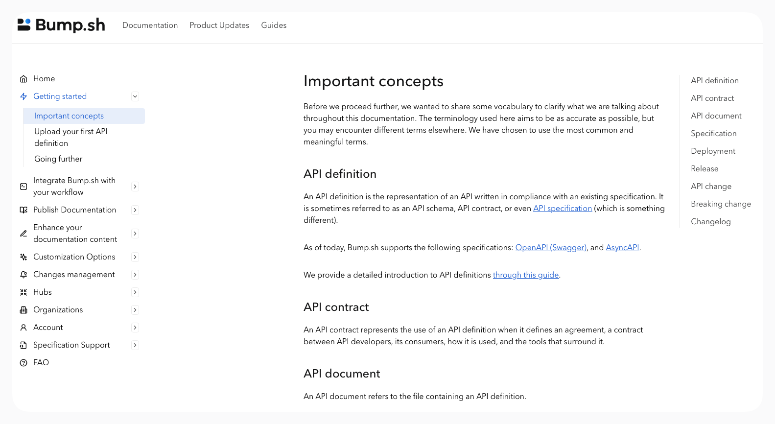
And then, ultimately, no. A Help Center isn’t a finished book that you send to the printer. It’s a living element of your product that accompanies it and, in a way, defines it a little. It evolves along with it, corrects itself, adapts according to the needs of everyone, whether in the team or among our users.
There are still some minor adjustments to be made here and there, pages to rework, or screenshots to redo. We even have plenty of ideas to make it even better, like GitHub’s fantastic context switching that adjusts information based on what you’re using (Web UI, CLI, App).
So why spend nearly 4 months on this Help Center? Because we consider it to be the finest showcase of what we do at Bump.sh. Whether to discover our product or to get the most out of it. To facilitate the work of support and, above all, to avoid the need to contact them (even though they’re always happy to hear from you).
For us, the Help Center isn’t the poor parent, the neglected part of the product. It reflects what we want to bring to our community, and we hope you’ll enjoy reading it as much as we enjoyed writing it.
